To Tackle Corruption, Target Systems, Not Just People
Cross-posted from the ONE Campaign blog.
When financial stories make the news, they usually come with a villain attached. People love the “Who” in the fight against corruption. Banks like Goldman Sachs become the Darth Vader of the financial crisis. Iceland’s Prime Minister Sigmundur David Gunnlaugsson gets ousted when his offshore deals appear in the Panama Papers.
It’s much harder, however, to tell a story about systemic problems—the “What” and the “How.”
When corruption relies on a tangle of fiscal flows, rules and entities (organizations as well as people), corruption fighters need ways to make that system a character in the story. That’s why the journalists who released the Panama Papers worked hard to create a visual layer for the connections between more than 200,000 offshore entities.
This matrix of connections, exploiting weaknesses in the financial system, is the real mechanism of corruption—and, potentially, the delivery system for better anti-corruption measures.
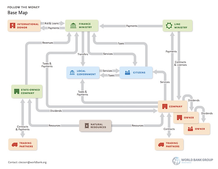
To support this week’s Anti-Corruption Summit in the United Kingdom, the World Bank is releasing an updated “Follow the Money” visual. The diagram is designed as a conceptual tool, deliberately simplified to illustrate multiple financial flows as a single system.
As world leaders work toward new anti-corruption commitments in London this week, they will tackle questions of beneficial ownership, disclosures on natural resource management and public contracting. How will these different commitments align? Will they address known gaps in regulation and open data? Mapping these commitments visually can inform such analysis.
The diagram is designed with three related goals:
- To help governments, advocates and journalists more easily explain financial systems, areas of corruption risk and points of possible intervention
- To annotate financial flows with specific data sets and monitoring frameworks, per country or per methodology
- To provide regulators and corruption-fighters with a common reference point to map their efforts, break down “silos” and strengthen cooperation
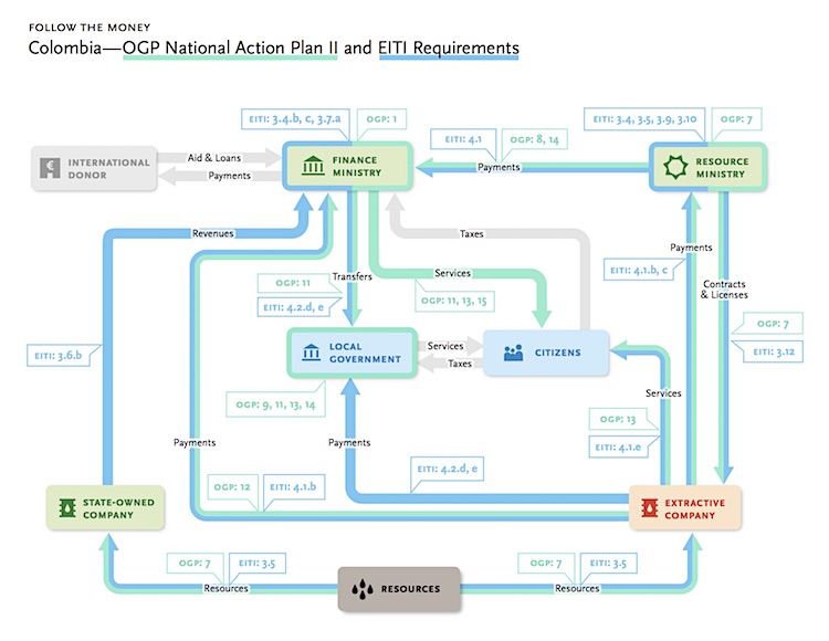
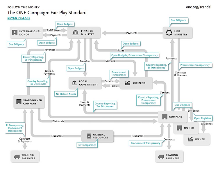
In recent months, we’ve worked with the Independent Reporting Mechanism of the Open Government Partnership, the ONE Campaign, and several others to show how different frameworks for transparency can be visualized as “layers” on top of the basic diagram.

Like the Linkurious tool used to display companies and individuals in the Panama Papers, the visual seeks “to make the data exploration accessible to non tech-savvy investigators.” We have begun by refining the “base map,” to confirm it works in multiple contexts before creating a version online. Looking ahead, we will be collaborating with designer John Emerson, participants from the Anti-Corruption Summit and the Panama Papers project, and colleagues from OGP and the Follow the Money Network to co-design an interactive, customizable visualization.
To provide us with questions or feedback, please contact Christina Tecson. You can also visit World Bank’s Governance page to watch for new versions of this evolving tool.

